


Laurens van den Acker took over the wand at Renault as chief designer in 2009. He once again put the brand on the map with design. With a design strategy centered on the symbolism of the flower’s life cycle, Renault has been aptly enlivened by its emotional design DNA. Renault models can be recognized at a glance by their sensual, Latin and colorful design language. The new design strategy was conceived in different ways and, moreover, explained very clearly with the concept cars, each cleverly executed in the distinctive colors of the life cycle flower. Through this aggressive strategy, well communicated in press releases, videos and the design of the concept cars themselves, Renault has become a unique, powerful, relevant and proprietary brand once again. And it is not unimportant that the concepts were translated into production models and the brand again sold several cars.
The recently revised Megane E-Tech Electric is an evolution of the design language introduced by Van den Acker. Renault’s familiar creamy shapes with literally sharper edges. Relatively large and excellent wheels, good stance, plenty of carving on the leather and rich detailing. Excellent work.
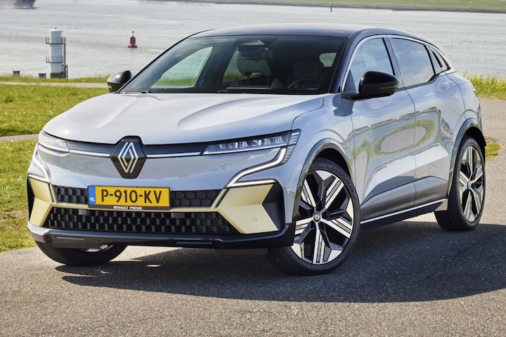
And now, after an unprecedentedly successful comeback and a wide model range executed almost perfectly, Renault comes with the Rafale. This car is not immediately recognizable as a Renault. In fact, given the design language of Peugeot’s French competition, the car is hardly original or refreshing. The entire design team has thrown Renault’s successful DNA out, rather than developing it further. Really nothing of the previous hard work and rigorous determination has been retained.
The Renault Rafale came out of the blue
Furthermore, the route change has not been reported conceptually. A number of concept cars were shown, but apparently as blanks – all of a different shape and for no conclusive reason. The Rafale – its introduction as a bolt from the blue and the communicative void in which it all happened – is completely at odds with the modus operandi that helped Renault a few years ago and has been so successful for years.
In terms of design, the Rafale is hard on the face, so it is also difficult to find the former French sympathy – in addition to its own identity. Furthermore, the nose now lacks the typical, distinctive shape spectrum that has been applied vigorously in various ways across the range: the under-way graphic.


The Rafale isn’t poorly designed – although it can’t be in the shadow of the Megane E-tech – because consistent aesthetic solutions have been applied. It all makes sense. However, the ideas hit a pincer on a pig without any calibration to a conceptual story. Nothing tells us about Renault here and Renault didn’t tell us anything about the lane change.
Here is the new Renault. But nobody knows. or settle down. After a much-needed, meticulously-organised, and of course meticulously-executed, relevant change, why did this brand make such a sudden and illogical shift? Seemingly for no reason. The automotive design community is confused.

Niels van Roy
Columnist/writer
With his own car design studio, Niels van Roij focuses on building vehicles and has painted, among other things, the Model SB, Adventum Coupe, Silver Specter Shooting Brake, Breadvan Hommage and Daytona Shooting Brake Hommage. He is also co-owner of Heritage Customs, which carries out the finishing work on the new Land Rover Defender.

“Total coffee specialist. Hardcore reader. Incurable music scholar. Web guru. Freelance troublemaker. Problem solver. Travel trailblazer.”
More Stories
These items are often taken from hotel rooms by guests
Energy company EnergyVision warns against giving up: what exactly is this?
After 2030, it’s not just electric vehicles